Brand Color Psychology: Make Your Colors Say the Right Thing
Before anyone reads your headline, scans your menu, or clicks your call to action, they’ve already had a reaction to your brand. That gut-level response happens in milliseconds, and it’s almost entirely driven by color. It shapes whether a visitor feels trust, excitement, calm, or confusion. For small businesses competing in a crowded world, your color palette is one of the fastest ways to communicate who you are and stand out from the noise.
TL;DR – Key Takeaways
- Personality Match: Your colors should reflect your brand’s personality and industry, not just your personal taste.
- Competitive Contrast: A smart palette helps you stand out from the visual sameness of your competitors.
- Unyielding Consistency: Your colors must be identical across your website, social media, emails, and all marketing materials to build recognition.
- Accessibility is Non-Negotiable: Your text and background colors must have enough contrast to be readable for everyone.
Here’s the thing, though. I’ve seen countless business owners pick their brand colors the same way they’d pick paint for a living room, based purely on personal preference. “I like blue” is a perfectly fine reason to paint a bedroom, but your brand palette has a much bigger job to do. It needs to signal who you are, who you serve, and what makes you different, all before a single word of copy is read.
Three Questions Your Brand Palette Must Answer
If your color palette can’t give a clear “yes” to these three questions, it’s not pulling its weight. Let’s break them down.
1. Does it match your brand’s personality?
Think about the difference between a pediatric dentist and a criminal defense attorney. Both need to project trust, but the vibe is completely different. The dentist’s office might use warm pastels and bright, friendly accents to say “approachable, safe, and playful.” The law firm, on the other hand, will likely use deep navy, charcoal, and metallic tones to communicate “serious, authoritative, and stable.”
If your colors could easily belong to any business in any industry, they’re too generic. They aren’t doing the strategic work of aligning with your audience’s expectations and setting the right emotional tone from the first glance.
2. Does it stand out from your competitors?
Go ahead and do this right now: pull up the websites of five local businesses in your space. I’m willing to bet you’ll see the same two or three colors repeated over and over. Tech companies love their blues, wellness brands lean on earth tones, and financial services often stick to green and gray.
This is actually great news for you. That sea of sameness is an opportunity. By choosing a palette that intentionally breaks the pattern, while still feeling appropriate for your industry, you become instantly more memorable. When a potential customer has five tabs open comparing their options, you want to be the one that visually stands out.
3. Is it consistent everywhere?
This might be the most common mistake I see. You might have a clean, modern blue-and-white scheme on your website that looks fantastic. But if your Instagram posts are a random assortment of Canva templates in coral and gold, you’re fracturing the impression you’re trying to build. You’re making your audience’s brains work harder to connect the dots.
True brand recognition is built through repetition. Consistency across your website, email signatures, social profiles, business cards, and even your invoices compounds that recognition over time. It all adds up to create a cohesive, professional, and trustworthy image.
How to Run a Quick Color Audit (No Design Degree Needed)
You don’t need to be a designer to spot inconsistencies. Just open your website, your most recent email blast, your Google Business Profile, and one social media profile side by side. Then, ask yourself one simple question: could a stranger tell these all belong to the same company?
If the answer is “eh, maybe not,” it’s time to rein things in. Here’s how:
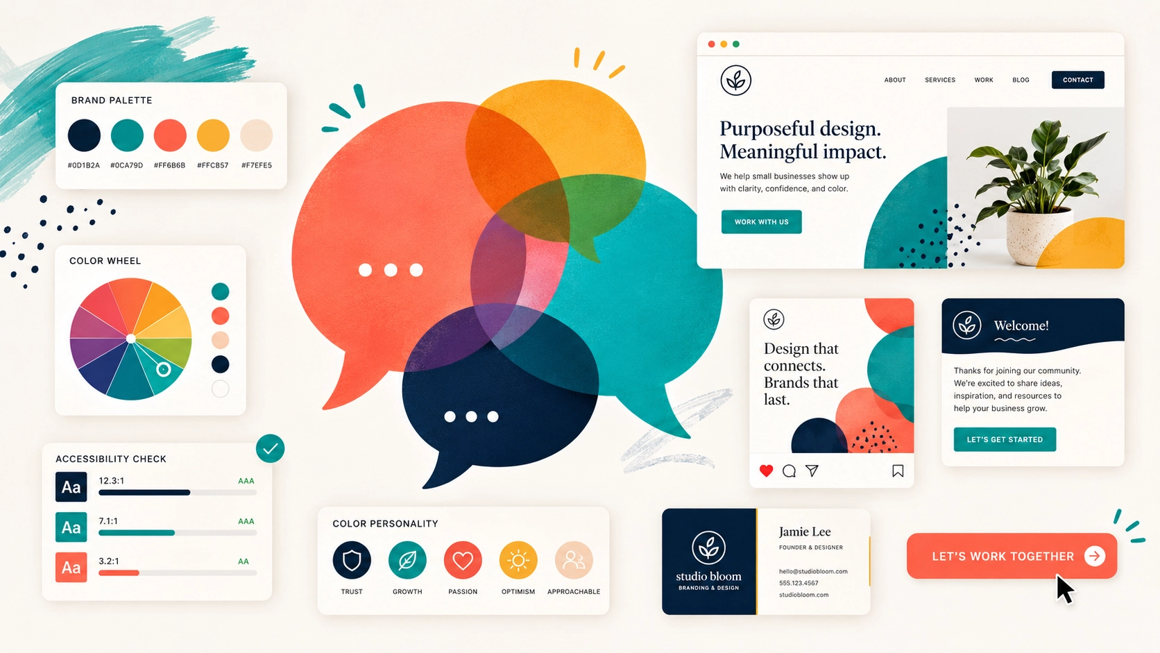
- Identify All Your Colors: Use a free browser extension (just search for a “color picker” or “eyedropper” tool) to grab the specific hex code for every color you see across your assets. A hex code is the six-character code, like #3366FF, that ensures your blue is the exact same shade of blue everywhere.
- Compare and Consolidate: Are you using five different shades of gray? Is your call-to-action button orange in one place and red in another? Make a list of the official hex codes for your brand and start updating the outliers.
- Check Your Contrast: This is a big one. Your text color and background color need enough difference between them to be easily readable, especially on a phone screen in bright sunlight. Use the free WebAIM Contrast Checker tool online. Just plug in your two colors, and it will tell you instantly if you pass accessibility standards. If you don’t, you’re making your content difficult to read for everyone, and nearly impossible for the roughly one in twelve men with some form of color vision deficiency.
Pro Tip: Create a One-Page Brand Guide
The best way to prevent this “color drift” from happening again is to document your choices. You don’t need a 50-page branding manual. Just create a simple, one-page document that lists:
- Your primary, secondary, and accent color hex codes.
- The names of your headline and body text fonts.
- A few basic rules for how and where to use your logo.
Save it as a PDF and share it with any employee, contractor, or virtual assistant who creates materials for your business. This simple cheat sheet is the single best tool for maintaining consistency as your business grows.
Frequently Asked Questions
Q: How many colors should be in a brand palette?
A: A good rule of thumb is three to five colors. Typically this includes a primary color, a secondary color, an accent color for buttons and highlights, a dark color for text, and a light color for backgrounds. This gives you enough variety without creating visual chaos.
Q: What is a hex code?
A: Think of it as a specific paint formula for the web. It’s a six-character code preceded by a hashtag (e.g., #FFFFFF for pure white) that tells any browser or design program the exact shade of a color. Using hex codes ensures your ‘brand blue’ is the same precise color everywhere, every single time.
Q: Can I just use a free online color palette generator?
A: Those tools are a fantastic starting point for inspiration, but don’t just copy and paste a palette without thinking. A generator doesn’t know that your top three competitors all use the same teal. Use them for ideas, then vet those ideas against your brand personality and your competitive landscape.
Q: What if I hate my current brand colors?
A: Unless you’re undergoing a full rebrand, avoid a sudden, drastic change that could confuse your existing audience. A better approach is a gradual evolution. You could slowly introduce a new accent color or tweak the shades of your primary colors over a few months to bring your audience along with you.
Your Colors Are Always Talking
Whether you chose them intentionally or not, your colors are speaking on your behalf every single day. They’re shaping perceptions and building an identity in the minds of your customers. The good news is that you don’t have to launch a massive rebranding project to fix any issues.
Often, the biggest impact comes from small changes. Commit to one accent color for every call-to-action button. Swap