What Mobile-First Design Really Means (Not Just Responsive)
I see it all the time. A business owner tells me their website is “mobile-friendly.” When I ask how they know, they say, “I pulled it up on my phone and it looks fine.” That, my friends, is the equivalent of tasting one grain of rice and declaring the whole pot is perfectly cooked. It’s a start, but it misses the entire point.
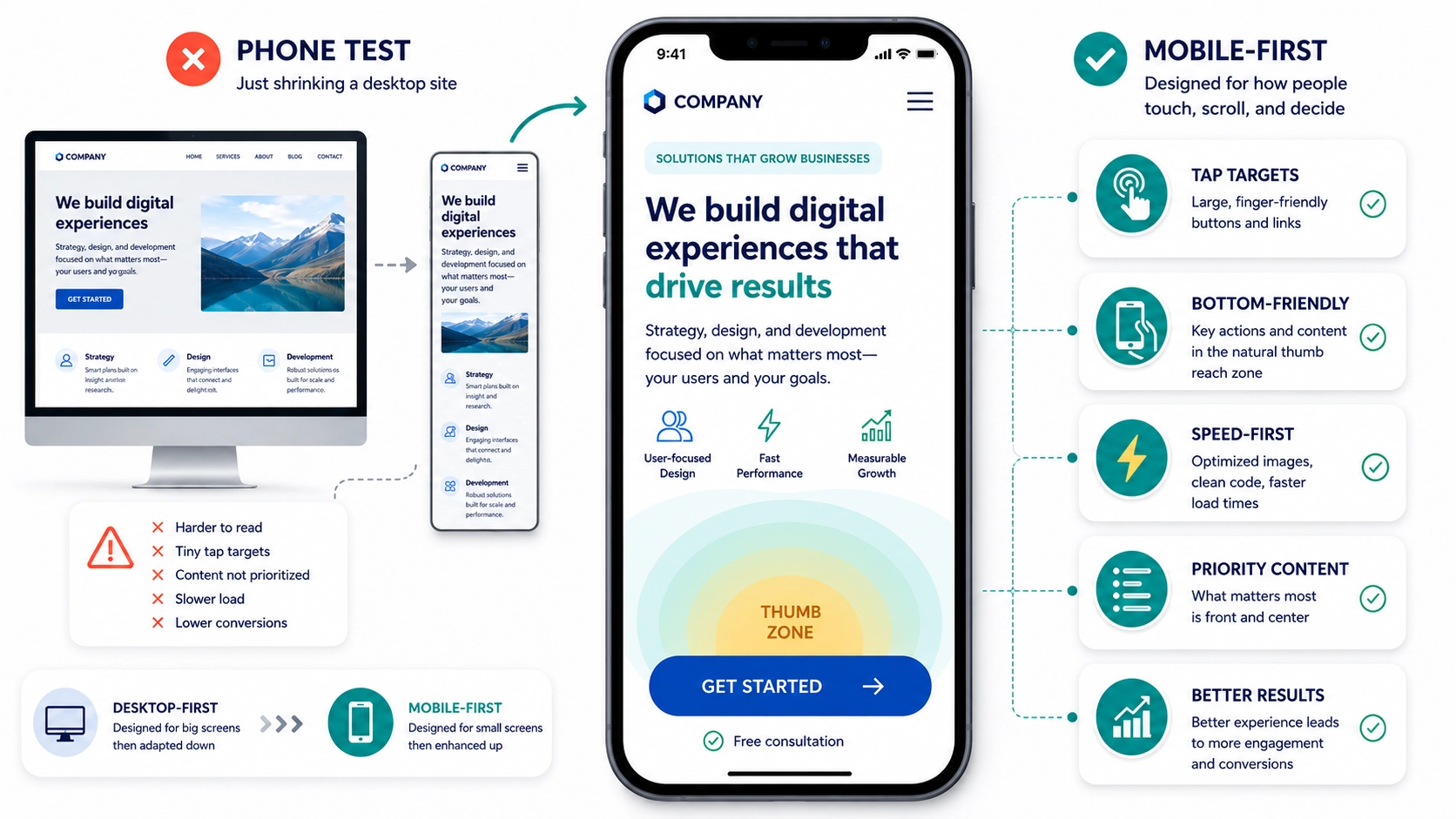
That quick glance is just a “phone test.” It checks for catastrophic failure, and that’s about it. “Mobile-first,” on the other hand, is a completely different philosophy. It’s not about making your desktop site shrink gracefully, it’s about building the entire experience with the mobile user as the star of the show from the very beginning.
TL;DR – Key Takeaways
- Mobile-first is a strategy, not a checklist. It means you design the small-screen experience before you even think about the desktop version.
- Responsive design isn’t enough. A site can be “responsive” but still offer a terrible user experience by burying important content and calls to action on mobile.
- Focus on the user’s primary goal. True mobile-first design identifies the single most important action a user needs to take on a page and makes it obvious and easy.
- Ergonomics and speed are critical. How people physically hold and use their phones (thumb zones) and their limited patience for slow-loading pages must guide your design.
Where “Responsive” Falls Short
For years, “responsive design” was the gold standard. The idea is simple: the website’s layout responds to the size of the screen it’s on. On a big desktop monitor, you get three columns. On a tablet, maybe two. On a phone, it all stacks into a single column. Problem solved, right?
Not quite. Responsive design is now table stakes, it’s the bare minimum you should expect. By itself, it’s a lazy solution. Imagine your desktop homepage has a big beautiful banner, followed by three columns highlighting your key services, and your “Request a Quote” button is in the top right corner. When that stacks responsively, a visitor on their phone might have to scroll past the banner and all three of those service blurbs just to find out what you want them to do. The most important action is buried.
If 60 to 80 percent of your traffic is on mobile, which is typical for most businesses I work with, then a “desktop-down” approach means you’re designing for the minority of your users first. It’s backward thinking.
The Core of Mobile-First: What’s the Point?
A true mobile-first approach flips the script. It forces you to answer a crucial question for every single page: what is the one thing a visitor absolutely needs to do here?
This constraint is a gift, not a limitation. It cuts through the clutter. You stop trying to cram everything onto the screen and start prioritizing with ruthless efficiency.
- On a services page, the point is to generate a lead. That “Get a Quote” button shouldn’t be an afterthought, it should be right there, visible without scrolling.
- On a blog post, the goal might be sharing or subscribing. A sticky share bar or a clear newsletter signup form becomes the priority.
- On a product page, it’s about the sale. The price, the main product image, and the “Add to Cart” button are the heroes. Everything else, like detailed specs or reviews, can sit further down the page.
By solving for the most constrained environment first, you make tough decisions about what’s truly important. Then, when you move to design the tablet and desktop versions, you can strategically add secondary information and features back in. You’re adding, not subtracting, which always leads to a cleaner, more focused result.
Thumb Zones and Why Your Fingers Matter
Here’s something designers often forget: people don’t use a mouse on a phone. They use their thumbs. And that thumb has a limited, comfortable range of motion, especially when holding the phone one-handed.
Think about how you hold your phone. The easiest area to tap is the bottom-center arc of the screen. The hardest parts to reach are the top corners. So, if your most important navigation link, like the classic “hamburger” menu icon, is crammed into the top-left corner, you’re literally making your site harder to use.
This extends to the size of your buttons and links, often called “tap targets.” Both Apple and Google recommend minimum tap targets of around 44 to 48 pixels. That’s a technical number, but the principle is simple: if you have to zoom in or carefully aim your finger to hit a link, it’s poorly designed. Buttons should be big, with plenty of space around them, and placed where thumbs can easily find them.
Pro Tip: The Coffee Shop Test
Don’t just test your site on your blazing-fast office Wi-Fi. Take your phone to a coffee shop with spotty service, or even turn Wi-Fi off and use your cellular data. How fast does it load now? A page that loads in two seconds at your desk can easily take six or seven seconds in the real world, and that’s an eternity for an impatient user. This simple test gives you a much more realistic picture of your mobile performance and highlights the critical need for speed optimization.
Frequently Asked Questions
Q: Is “mobile-friendly” the same as “mobile-first”?
A: No. “Mobile-friendly” or “responsive” usually means a desktop site was adapted to work on smaller screens. “Mobile-first” means the mobile experience was designed from scratch as the primary version, with the desktop version being the adaptation.
Q: Do I need a completely separate mobile website (like an m.domain.com)?
A: Almost never. This was an old solution that created major headaches with duplicate content for SEO and maintenance. A single, well-designed responsive site built with a mobile-first strategy is the modern, correct approach for 99% of businesses.
Q: How do I figure out what the “one thing” is for my users?
A: Start with your business goals for that page. Then, look at your website analytics to see what users are actually doing. Tools like heatmaps can also show you where people are clicking and scrolling, revealing their true intent.
Q: Can my existing website be converted to a mobile-first design?
A: Sometimes, but it often requires a significant redesign rather than a simple tweak. It involves re-evaluating the entire content hierarchy and user flow from the ground up. It’s less about changing code and more about changing your entire strategy for the site.
It’s a Mindset, Not a Tactic
Treating your mobile experience as a shrunken-down version of your “real” website is a recipe for mediocrity. Your customers are on their phones in line for coffee, on the couch, and in parking lots. Their context is different, their patience is shorter, and their needs are more immediate.
Adopting a mobile-first mindset isn’t just about appeasing Google or checking a box. It’s about showing empathy for your users. It’s about making their lives easier and, in doing so, making it easier for them to do business with you. If you’re ready to stop just testing on your phone and start building for it, we should talk.